Passionate about paper (and postcards)
Researching ideas for my interactive postcard campaign has therefore led me on to very inspiring finds and it's really hard to stop looking! Here are a few of my favourites so far:
This sundial business card was created for an antique watch collector.
Postcarden: A greeting card that lets the recipient grow his/her own cress!
Bosch lawnmower calendar: Each day, the recipient gets to tear off from specially cut papers that mimic a wild lawn – leaving a perfectly mowed lawn at the end of the year.
Eyeball.ing – refining the brand identity
A few dozen tweaks later, I've got these to show as fruits of my labour. From testing how the logo looks with the addition of an 'eye', to the thickness and kerning of the typeface, and on to developing the elements that would eventually form the accompanying graphics, these will then be incorporated in the interface design of the iPhone app.
A beginner's attempt at mapping an app
I tried sketching these out on an A4 piece of paper, I really tried.
Even after reading through resources such on Interactive Sketching and How to Create an iPhone App, I was still stumbling along. Then I recalled how someone once said that if you're stuck sketching out an idea, try a different tool to draw it with, and voila!
Using post-it notes this way also enabled me to think a lot clearer and feel less apprehensive about thinking what each page needed. This is how the different parts sit:
• links
• pages
• actions (for user)
• functions
So now I've figured out how the iPhone app would work, it's on to visualising it!
Testing, testing... seek, inquisitor and eyeball
As the first few results come trickling in, here's a snapshot of what's been noted so far. Each participant was given a set of postcards – one logo per postcard, and a brief explanation on the service being offered (ie. alternative London events/venues).
They were then asked the following:
1. What are your first impressions of this logo? (Please describe in 3 words.)
2. How does the logo make you feel? (Again, please describe in 3 words.)
3. How well do you think this logo relates to the service?
The answers were then detailed on the back of the card, and at the end of the test, the participant was asked to state their preferred logo. The comments made a really interesting read, but I'm not going to detail every one of them here – it's more fun to read it in the original handwriting! ;)
Alter-egos
I also wanted to experiment how the logo would lend themselves to simply being graphics, and out popped 4 designs for the shortlisted logos, complete with 5 characteristics for each detailed behind. Cue, photos!
The FMP – logo development - Round 2
My preferred versions for each name have been enlarged and placed in the bottom right corner of each jpeg. With a bit more tinkering where needed, these will then be tested with a sample of the target audience of 25-40 year olds – that might just be you!
(Don't shy away from expressing pre-testing opinions now...)
Pencilled in
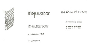
Making the shortlist
Presenting...The official brief
To promote a service that showcases 'alternative' London events/venues offering eccentric, off-beat experiences in the city
Challenge
• to create a visually rich user experience
• to create paper-based interaction
Insight
London's vibrant culture offers abundant opportunities to experience the unexpected, exciting and unusual.
• Not many people know where or how to start looking for such experiences however.
• There is a certain thrill that accompanies a new discovery followed by an eagerness to share it with friends.
The big idea
Central to the theme of this service is the ability to discover new encounters, and I'd like to capture this in the spirit of an amateur sleuth investigating promising leads on a mission. I'm also interested in utilising different channels of delivery within the campaign.
Ideally, this would result in interactive postcards that would reveal hidden messages, enticing recipients to learn more about the service. The augmented reality application similarly reveals the (previously unexpected) events/venues in London locations to users via their mobiles. Online, users will have the option to add on their own 'alternative networks' to either share with the public or simply with their own friends.
Primary target audience
25-40 year old Londoners tired of the same haunts and looking for something new/novel.
Communication channels
Integrated campaign
• series of postcards that need to be 'decoded' (can be re-posted to friends to share)
• mobile/web application utilising augmented reality with the option to customise networks (simultaneously generating alternative maps of London)
The Beginning of the End...
I'll be looking out for events like Telectroscope (2008) – "the secret tunnel that runs deep beneath the Atlantic Ocean" connecting New York and London and Down the Rabbit Hole (2008), a multi-arts event inspired by Alice in Wonderland.
Our Skin Never Forgets
Summing up sustainable design
Be it in industrial design, architecture, fashion, engineering or graphic design, sustainable design is viewed as the way forward. It's about what we use and how we use things, and far from having to give up an entire lifestyle, I feel it's more about being as efficient as we can. It's about being more responsible and aware of the repercussions of our actions, without having to live like hermits. It's also about coming to terms with a different way of thinking.
The School of Visual Concepts, Seattle, together with AIGA Seattle, have come up with 101 Things Designers Can Do to Save the Earth, and some of the tips that stood out for me were:
#94. Try not to bleed
Bleeding requires printing on oversized stock with more ink, which all gets trimmed off and discarded as waste. So it's worth considering smaller sizes that fit within standard sheet sizes.
#64. Develop packaging with multiple uses
Instead of designating used packaging for recycling, how can we design it to be reused for another purpose beyond merely containing a product?
#63. Start with the need, not the end result
"What else could you do to accomplish the client’s objectives without necessarily going with paper or energy-based solutions?"
Beyond following guidelines, sustainable design can be truly inspiring in its outcome, and I couldn't resist sharing these!
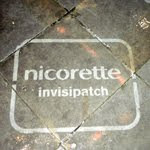
London-based Curb, provide achingly cool advertising solutions, as their work attests. They've developed sea tagging (top image), using sea water to create visuals – the salinity means that the images evaporate at a considerably slower rate than normal water, and clean advertising, using custom made equipment that lifts dirt from surfaces to create messages. And there's a whole lot more, ranging from bioluminescence to moss art and solar art.
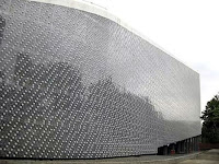
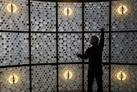
In the field of architecture, EcoARK in Taiwan, certainly embraces the concept of recycling wholeheartedly with its construction from a mind-blowing 1.5 million PET bottles. At three stories high, it features an amphitheatre, an exhibition hall and even a screen of falling water that is collected when it rains to be then used as air conditioning.
Smaller in scale, but big in impact, is Puma's commendable effort in reducing its shoe packaging by proposing the use of a recycled PET bag (recyclable too) with a single sheet of cardboard. If implemented, Puma stands to save 8,500 tonnes of paper, a million litres of water and a million litres of fuel, reduce paper needs by 65% and annual carbon emissions by 10 tonnes! This forms part of their efforts to develop a 360 Sustainability Program called PUMAVision – puma.safe, puma.peace and puma.creative, which will no doubt be interesting to follow.
It's a mad, ad world
While advertising is often portrayed as an evil entity unleashing torrents of the next gleaming thing for innocent consumers to get hooked onto in its bid to empty pockets and profit that big corporation, I struggle to be completely sold by that concept.
A necessary evil, perhaps.
As it happens, I believe that the role of advertising is primarily to sell a product, be it goods and/or services, or to raise levels of awareness. I rather like the uplifting definition by the Advertising Standards Authority (ASA) as well – "Advertising... informs, entertains and promotes healthy competition". Now that, I reckon, could be a healthy way to view it.
If we think of advertisers as potential suitors courting a valuable interest (yes, that's you and me, folks), maybe we'd remember that our role here as the prized consumer is one that gets to make the choices. Having options (and plenty of it) can't be all bad.
Ultimately, advertising needs to keep to the path of the straight and narrow when it comes to ethics. Generally, adverts must not mislead and overpromise, or offend. There are more specific codes in relation to children, alcohol, gambling, motoring and health and financial products, with an overall emphasis of responsibility. In the UK, the latest round of advertising codes are set to come into effect on 1 September 2010.
There has been much debate on advertising for beauty products of late, with a greater call for honesty given the industry's notorious reputation in manipulating images to represent 'natural' beauty, which is being blamed for unhealthy obsessions with weight and appearances in society. To this end, it is reassuring to note that Cheryl Cole's hair extensions and various other models' eyelash extensions have been mentioned in shampoo and mascara adverts respectively, to avoid being misleading.
Good advertising to me, is about meeting consumers' needs in a way that is entertaining and leaves them wanting more. As a creative, generating a good piece of advertising is all about the big idea. A good big idea is one that grabs attention. A great one leaves a lasting impression. As a consumer, a good advert is one which allows me to develop a sense of affinity for the brand. I might not rush out and get my hands on the item advertised, but I'm more likely to consider it as an option if and when I might need something similar in future.
Bad advertising is one which is patronising. Consumers are way more sophisticated than what some advertisers would like to believe (marketing departments, are you listening?). Poor execution, cliche ideas, awful stereotypes – one has to wonder how they got approved.
All wrapped up in packaging
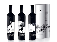

Apart from fulfilling the basic functions of housing a product and administering its contents, perhaps one of its most important roles while being simultaneously overlooked, is its use in differentiating products. As the Design Council puts it, how would you be able to choose one shampoo from another without its packaging?
In terms of aesthetics, the prevalent trend for contemporary packaging design seems to be more pared down and minimalistic, for eg. Selfridges, with clear, strong typefaces and block colours being the predominant look, and where possible, revealing the product as well – a style which seems to mark a return to a more functional form of design.
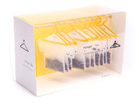
The combination of simple yet striking illustrations is also a popular trend (see references below), although who can resist witty solutions to packaging? I really like the singular thought behind Scanwood wooden kitchen utensils and the concept for Hanger Tea.
'Green packaging' though, is likely to be the benchmark for the future of packaging design, given the spotlight on sustainability, with issues such as excessive packaging impacting the environment and the recyclability of the materials used. Additionally, the Design Council points out that palette maximisation in transporting goods needs to be considered – the amount of air that is shipped needs to be minimised while maximising the number of products per pallet, besides having packaging that is able to last throughout the life cycle of the product.
Championing socially responsible design
"Social responsibility has economic and environmental dimensions. This broad perspective is often described as a commitment to “sustainability,” which has become a term-of-art for advancing economic activity while ensuring that we can sustain our activities in a sometimes fragile world without harming the future’s potential." – Richard Grefe, executive director AIGA (the professional association of design)
More Associates are loyal to this cause, and have formulated their design approach around 4 main principles; namely user-centred design, sustainable design, evidence-based design and interdisciplinary design. Research here seems to be key to their operations and in collaborating with academics, scientists, designers and engineers, 'form and function' definitely seems to be the order of the day. What strikes me as truly heartening is their pragmatism; they acknowledge that "conflicts" and "bad habits" need to be worked around while still benefiting the bottom line and yet, are able to marry this in aesthetically pleasing solutions.
 And to prove that they practise what they preach, even their stationery has been carefully produced so that a single print run is able to produce business cards, postcards and posters with the use of 2 different weighted stocks.
At IDEO, they've summed up their "approach to innovation" as Design Thinking, also drawing from a range of different disciplines in a "human-centred, iterative and practical approach". Discovering the breadth of speakers (IDEO Voices) they have on issues from aging to education, mobility and user interface design is simply mind-blowing.
What I find truly inspiring is how their work seems to defy boundaries, and why shouldn't it, seeing that they've whole-heartedly embrace Design Thinking in such a holistic manner? From brand identity and packaging design for Pangea Organics including a compostable bar soap box made from 100% post-consumer content, to crafting a cool-to-the-touch kettle and a clothes hanger that uses heat to remove wrinkles, IDEO also apply themselves to cultivating user experiences such as that of the American Red Cross Donors'.
Looking at Corporate Social Responsibility
While the cynics amongst us might write it off as "green-wash", arguably, it's human nature to want to feel good about the decisions we make, and in this case, what we consume. Organisations/companies with credible CSRs would therefore be seen to have integrity in their operations and win consumers over; mutually benefitting each other and the wider environment. Perhaps then, it's little wonder that the likes of Pret a Manger, Innocent and (RED) have gained their following.
Pret's CSR policy takes into account sustainability issues from packaging, food sourcing to energy consumption, as well as community/charity involvement via its Foundation Trust, all carefully detailed on its website, and even clues in its customers on how staff are rewarded. It's great that this information is so easily available; coupled with a well-designed identity, I get the impression that Pret takes prides in the little details.
Innocent works on a very similar model to Pret in terms of its CSR, and perhaps what's encouraging is that it readily shares information on the methodologies used in determining their efforts in sustainability, complete with helpful charts and graphs.
(RED) however, is an interesting case study, billed as a "business model designed to create awareness and a sustainable flow of money from the private sector into the Global Fund, to help eliminate AIDS in Africa". This is done by channeling a part of the profits from the sale of specially created (PRODUCT) RED products fronted by leading brands globally, and championed by U2's Bono,
Striking some as highly ambitious, (RED) deserves at least to be commended for being innovative in its approach and on such a scale. To date, $140 million has been raised, with less than 3% put down to administrative costs. Accountability here is highly integral, and the Global Fund has had to suspend grants to Uganda and Ukraine following the misuse of funds.
As a designer, I feel it is important that the service/product I'm designing doesn't over-promise and under-deliver, in particular, the copy being featured. Being a consumer myself, I really dislike being misled by sleek graphics only to be let down later. Sourcing appropriate materials and minimising waste also matters to me, and to that extent, I try to ensure that collateral is effectively distributed and easily recycled.
Gearing up for business
So. What's in a name?
- nova
- notabene
- frequency
- searchlight
- the edge
- transmission
- woven
- weave
- hatch
- scene
- etcetera
- spark
Animation Junkie
And if there ever was a reason to visit Linz, Austria, The Sancho Plan's Jungle Imperator would be it. Exploiting ultra-HD imagery on the wall and floor coupled with surround audio and stereoscopic 3D, the installation immerses its audience in an audio-visual adventure which allows them to control a cast of animated musical characters.
Jungle Imperator from The Sancho Plan on Vimeo.
So while it appears that animation/digital design is hurtling towards all things 3D, HD and hyper-reality, its 2D and stopmotion cousins are still very much in favour too. Especially with 'craft' back in trend, it's no wonder music videos like The White Stripes' Fell in Love with a Girl by Michel Gondry (Partizan) and Ramona Falls' I Say Fever by Tourist Pictures' Stefan Nadelman continue to have such strong fanfare.
Ramona Falls "I Say Fever" from Barsuk Records on Vimeo.
Wayfinding: 104 / Le Cent Quatre

As such, Experiment Jetset did manage to use their wayfinding system as they had originally intended in La Traversee (images above), an exhibition that took place in the cultural institute before it was officially opened. The concept centred on work-in-progress – "the idea that 104, as a project, is never finished, always evolving, eternally 'under construction' " and the use of scaffolding as an idea to represent the "continuous cycle of building, demolishing and rebuilding".
Walter Benjamin's The Arcades Project ,which had a chapter on the history and ideology of metal constructions and the use of iron in Paris (for eg. the Eiffel Tower), provided a rich source of inspiration for Experimental Jetset, particularly the idea of street furniture (barricades, billboards, kiosks, etc) and the 'street as a theatre' or 'theatre as a street' as expressed in Liubov Popove's constructionist stage designs.
Set with the notion of using iron constructions to emphasise the early industrial architecture of Le Cent Quatre, Experimental Jetset created a modular system of street furniture to house their sign system. Futura was chosen as the corporate font and then modified in parts due to its geometric form and early industrial references. With inspiration taken from the old geometric SMPF sign that stood at the site, they developed the cultural institute's logotype with the line/stripe, circle and triangle that made up 104, providing a base for the sign system:
- stripe as line to be followed
- circle as spot to mark a location
- triangle as arrow


good contrast type
complements its environment
cohesive link to its overall corporate identity
Weaknesses
circle denoting area might not be immediately obvious to the viewer as a destination marker
Experimental Jetset were not retained to complete the design of the remaining wayfinding system
– leaves the design vulnerable to being less effective and might result in confusion for the public
A Tale of Two Typefaces
Cousins and second cousins abound in this font family, branching out into 6 variants from each of the 3 “distinct letterforms” – TheSans, The Serif and TheMix. That’s a staggering 144 incarnations!
• Extra Light, Light, Semi Light, Normal, Semi Bold, Bold, Extra Bold and Black
• Plain, Italic, Small Caps, Small Caps Italic, Expert and Expert Italic
different sets of numerals specific to each weight
• for eg. hanging figures when used in lower-case text and lining figures when used in small-caps (where the figures share the same height space)
letterform based on writing with broad-nib pen
true italics
• individually designed, not directly adapted from the roman versions
low-contrast typeface
• defined as having differences between thin and thick strokes that are not very pronounced
Strengths
Weaknesses
Interesting anecdotes
On the other side of the spectrum of fonts (pun alert! – the word antithesis springs to mind), the experimental form of INBETWEEN just screams to be used in less conventional projects.
Conceived by Berlin-based design group Jutojo, the font was originally constructed for Jazzanova album’s “Inbetween”, but was confined to making a humble appearance in six 3D letters for the spelling of Jazzanova instead. This then led to the completion of the rest of the alphabet from the existing six letters, all made of wire covered in plastic tubes, and released in 2004.
Characteristics
Strengths
visually arresting
Weaknesses


