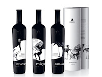


Apart from fulfilling the basic functions of housing a product and administering its contents, perhaps one of its most important roles while being simultaneously overlooked, is its use in differentiating products. As the Design Council puts it, how would you be able to choose one shampoo from another without its packaging?
In terms of aesthetics, the prevalent trend for contemporary packaging design seems to be more pared down and minimalistic, for eg. Selfridges, with clear, strong typefaces and block colours being the predominant look, and where possible, revealing the product as well – a style which seems to mark a return to a more functional form of design.
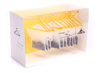
The combination of simple yet striking illustrations is also a popular trend (see references below), although who can resist witty solutions to packaging? I really like the singular thought behind Scanwood wooden kitchen utensils and the concept for Hanger Tea.
'Green packaging' though, is likely to be the benchmark for the future of packaging design, given the spotlight on sustainability, with issues such as excessive packaging impacting the environment and the recyclability of the materials used. Additionally, the Design Council points out that palette maximisation in transporting goods needs to be considered – the amount of air that is shipped needs to be minimised while maximising the number of products per pallet, besides having packaging that is able to last throughout the life cycle of the product.

0 comments:
Post a Comment